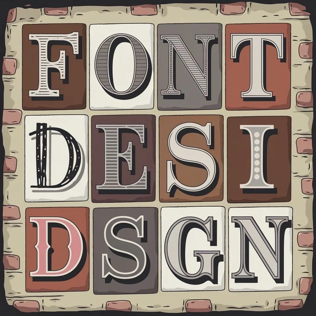
The Art of Font Selection in Custom Sign Painting

Introduction to Custom Sign Painting

Custom sign painting is an art form that goes beyond mere decoration; it tells a visual story. Each element of a sign, from color to layout, plays a role in this narrative, but nothing speaks louder than the font. The font choice can convey authority, playfulness, tradition, or modernity—all without a single spoken word. For those involved in custom sign painting, understanding the importance of font selection is crucial.

Historically, sign painters were the original typographers, crafting unique typefaces long before the digital age. In the early 20th century, these artists often created bespoke fonts that embodied the spirit of the businesses they represented. This tradition of using font as a powerful communicator of identity and values continues today, albeit with a much broader range of typefaces to choose from.

The Role of Fonts in Visual Communication

Fonts are more than just letters—they're powerful tools for conveying mood, tone, and intent. The design of a font can shape the viewer's emotional response and influence how they perceive the message. Take, for example, Bodoni, a serif typeface known for its elegance and sophistication. It’s a favorite for luxury brands, where it helps convey a sense of exclusivity and refinement.

In contrast, Futura, with its clean, geometric lines, exudes modernity and forward-thinking, making it ideal for tech companies. These examples show how different fonts can set the stage for the viewer's experience, guiding them to interpret the sign’s message in a specific way.

Understanding Visual Hierarchy Through Fonts

Fonts are also key to establishing visual hierarchy on a sign. For example, a bold, heavy sans-serif typeface like Impact will naturally draw the viewer's attention first, making it ideal for headlines. In contrast, the body text might use a more neutral typeface like Helvetica, which is legible and versatile, allowing the message to be absorbed without distraction.

The Psychological Impact of Different Fonts

The psychological impact of fonts is significant. Research shows that fonts can evoke different emotional responses. Comic Sans, for instance, is often associated with informality and playfulness, making it suitable for children's signs or casual event announcements. On the other hand, Garamond, with its classic, humanist design, evokes a sense of tradition and reliability, making it a popular choice for institutions like universities or law firms.

Font Selection Criteria for Custom Signs

Choosing the right font for a custom sign involves considering several factors: legibility, readability, size, spacing, and contrast. The font must not only be visually appealing but also effective in conveying its message.

Legibility and Readability Considerations

Legibility refers to how easily individual characters in a typeface can be distinguished, while readability is about how easily a block of text can be read and understood. For example, Times New Roman, with its distinct letterforms, is highly legible, making it suitable for body text in lengthy signs. Readability also depends on the spacing between letters (kerning) and lines (leading). A font like Arial, with its generous spacing, is often more readable in smaller sizes or on signs that require quick comprehension, such as road signs.

Appropriate Font Size and Spacing for Visibility

Font size is crucial, especially for outdoor signs that need to be read from a distance. Bold, condensed fonts like Franklin Gothic are excellent for creating large, impactful text within limited space. The spacing between letters and lines also affects readability. If the text is too cramped, it becomes difficult to read; if it’s too loose, it loses cohesion.

The Importance of Contrast in Font Selection

Contrast between the text and background is essential for readability, especially in varying lighting conditions. A light font like Didot on a dark background can create a striking, high-contrast sign that catches the eye. Conversely, a dark font on a light background, such as Roboto, provides a modern look while maintaining excellent readability.

Cultural and Contextual Relevance of Fonts

Fonts carry cultural connotations that can either enhance or detract from the sign’s effectiveness. For example, Papyrus has been criticized for its overuse and inappropriate application in professional settings, but its exotic feel might still be fitting for a themed restaurant or a business related to historical artifacts. Understanding the cultural context ensures that the font resonates with the intended audience and aligns with the sign’s purpose.

Popular Font Styles in Sign Painting

Different font styles serve various purposes in sign painting, each bringing its own unique character to the message.

Serif Fonts and Their Applications

Serif fonts, such as Georgia or Times New Roman, are characterized by the small lines or strokes attached to the ends of their letters. These fonts are often seen as formal and traditional, making them ideal for businesses that want to project stability and trustworthiness, like banks, law firms, and educational institutions.

Sans-Serif Fonts and Their Modern Appeal

Sans-serif fonts, like Helvetica or Arial, lack the extra strokes, giving them a clean, modern look. They are associated with simplicity and efficiency, making them popular in contemporary sign designs, particularly in the tech and fashion industries.

Script and Cursive Fonts for Artistic Flair

Script fonts, like Brush Script or Lobster, mimic the strokes of handwriting and are often used for their elegant, personal feel. These fonts are perfect for businesses that want to convey creativity and sophistication, such as boutique shops or wedding services. However, script fonts can vary in legibility, so they are typically used sparingly.

Decorative and Novelty Fonts for Unique Designs

Decorative and novelty fonts are designed to stand out and are often used for specific themes or to create a unique visual impact. Fonts like Cooper Black can be used to create a sense of fun or nostalgia. However, these fonts are often highly stylized, which can compromise readability, so they should be used carefully, usually only for headlines or titles.

Matching Fonts to the Message

Choosing the right font is like selecting the perfect voice for your message. The font should complement the content, enhancing its impact rather than detracting from it.

How Fonts Influence the Tone of a Message

Consider a sign for a luxury spa. A font like Didot, with its high contrast and refined elegance, would be an excellent choice to convey luxury and exclusivity. On the other hand, a font like Marker Felt would be more suitable for a children's play area, with its informal, playful style matching the fun atmosphere.

Examples of Font-Message Mismatches

Using Comic Sans in a professional context, such as on a legal document, undermines the seriousness of the message, leading to a lack of credibility. Similarly, using a heavy, ornate font like Blackletter on a modern, minimalist sign could create a visual disconnect that confuses the viewer.

Aligning Font Choice with Brand Values and Target Audience

The font you choose should resonate with the brand’s values and appeal to its target audience. A company focused on sustainability might opt for a font like Lato, reflecting a commitment to modern, eco-friendly practices. Conversely, a brand steeped in tradition might prefer Garamond, signaling reliability and heritage.

The Impact of Fonts on Brand Perception

Fonts play a significant role in shaping how a brand is perceived. They contribute to the overall visual identity, influencing everything from customer trust to brand loyalty.

Case Studies on Successful Font Usage in Signage

The Coca-Cola logo, with its custom script font, has become iconic over the years. The flowing, cursive style evokes nostalgia and tradition, perfectly aligning with the brand’s image as a timeless, classic soft drink. Another example is the Disney logo, where the whimsical font reflects the brand’s focus on imagination and childhood wonder.

Negative Impacts of Poor Font Selection on Brand Perception

Poor font choices can damage a brand’s image. The Gap logo redesign in 2010, which briefly replaced the iconic serif font with a generic sans-serif, was met with widespread criticism. The new font failed to resonate with the brand's established identity, leading to a backlash that forced the company to revert to the original design.

Customization of Fonts for Unique Signs

In many cases, existing fonts might not fully capture the essence of a brand or message. Custom-designed fonts offer a unique, tailored approach that can set a sign apart from the competition.

Custom-Designed Fonts vs. Pre-Existing Fonts

Custom fonts are designed specifically for a brand, ensuring that every aspect of the typeface aligns with the brand’s identity. While creating a custom font can be more costly and time-consuming than using a pre-existing font, the payoff in terms of brand differentiation can be significant.

The Process of Creating Custom Fonts for Sign Painting

Creating a custom font involves collaboration between designers and clients to ensure that the font reflects the brand’s values. The process typically starts with sketching ideas, followed by refining the design digitally. The final product is then tested to ensure it works well in the intended application.

Digital Tools for Font Selection and Design

The digital age has brought a wealth of tools that assist in font selection and design for custom signs. These tools enable designers to experiment with different typefaces and layouts, ensuring the final product meets the client’s expectations.

Overview of Font Selection Software

Software like Adobe Illustrator and CorelDRAW are industry standards for designing custom signage. These programs offer a vast library of fonts and allow designers to manipulate typefaces with precision.

Integrating Digital Tools with Traditional Sign Painting Techniques

While digital tools offer precision, hand-painting often adds a tactile, human touch that makes signs unique. Designers might use digital tools to create a template, which is then transferred to the sign surface for hand-painting, combining the best of both worlds.

The Art of Hand-Painted Lettering

Hand-painted lettering is a traditional craft requiring skill and patience. Despite the rise of digital printing, hand-painted signs remain popular for their authentic appearance.

Techniques for Hand-Painting Fonts on Signs

Hand-painting begins with sketching the design onto the sign surface. Once the sketch is complete, the letters are carefully painted using brushes and enamel paints. Fonts like Caslon or Gotham are often chosen for hand-painted signs due to their clarity and strong visual presence.

The Role of Craftsmanship in Font Selection

Craftsmanship is vital in font selection for hand-painted signs. The slight variations and imperfections in hand-painted letters add character and depth, creating a one-of-a-kind piece.

Trends in Font Usage in Custom Signs

Font trends in custom sign painting evolve over time, influenced by cultural shifts, technological advancements, and changing tastes.

Current Trends in Font Styles for Sign Painting

One current trend is the resurgence of retro fonts, such as Hobo, which evoke a sense of nostalgia. These fonts are popular in businesses that want to project a vintage vibe. Meanwhile, minimalist fonts like Proxima Nova are favored for their clean, modern aesthetic.

The Resurgence of Vintage and Retro Fonts

Vintage fonts like Copperplate Gothic are making a comeback as businesses seek timeless design. These fonts often carry a sense of history and authenticity, making them a popular choice for establishments that want to convey a connection to the past.

Predictions for Future Font Trends in Signage

Looking ahead, there may be a greater emphasis on custom fonts as brands strive for uniqueness. Additionally, animated and interactive fonts in digital signage could become more common, offering new ways to engage viewers.

Common Mistakes in Font Selection

Despite the importance of font selection, many signs fall short due to common errors.

Overcrowding Signs with Multiple Fonts

Using too many fonts on a single sign can lead to visual clutter and confusion. A good rule of thumb is to stick to two fonts—one for headlines and another for body text.

Ignoring Font Readability from a Distance

Another frequent error is choosing fonts that look good up close but are unreadable from a distance. Fonts like Impact are excellent choices for outdoor signs due to their thick, clear letterforms.

Misjudging the Cultural Appropriateness of Fonts

Cultural context is critical in font selection. Using a font like Curlz MT for a professional sign can send the wrong message and alienate potential customers. It’s essential to consider how the font will be perceived by the target audience.

Case Studies of Iconic Custom Signage

Studying iconic signage offers valuable insights into the power of font selection.

Analysis of Famous Signs and Their Font Choices

The Hollywood sign, with its simple, bold sans-serif letters, is an example of effective font usage. The font is easily readable from a distance and has become synonymous with the entertainment industry.

Lessons Learned from Iconic Sign Designs

These iconic signs teach us the importance of clarity, consistency, and cultural relevance in font selection. They show that the right font choice can elevate a sign from mere information to a symbol of identity and pride.

The Economic Impact of Font Choice

Font selection is not just an aesthetic decision—it can have significant economic implications.

Cost Considerations in Font Selection

Custom fonts can be expensive to create, but they offer a unique advantage in branding. On the other hand, using pre-existing fonts can be more cost-effective but may limit the sign’s distinctiveness.

The Return on Investment of Effective Font Usage

A well-chosen font can increase the effectiveness of a sign, attracting more customers and enhancing brand recognition. For example, the FedEx logo, with its hidden arrow, is a masterclass in subtle, effective design.

Best Practices for Font Selection in Signage

To achieve the best results in custom sign painting, follow certain best practices.

Guidelines for Choosing Fonts in Different Industries

Different industries have different font needs. Healthcare facilities might opt for fonts like Avenir, which are modern and easy to read. In contrast, a restaurant might choose a more stylized font like Bistro Script to reflect its culinary identity.

Collaboration Between Designers and Clients in Font Selection

Collaboration is key to successful font selection. Designers should work closely with clients to ensure the chosen font aligns with the overall vision, creating a sign that is both aesthetically pleasing and effective.

FAQs on Font Selection in Custom Sign Painting

What are the most legible fonts for outdoor signage? Fonts like Helvetica, Arial, and Futura are highly legible for outdoor signage due to their clear, simple letterforms.

How does font choice affect the durability of a painted sign? Simpler fonts with fewer intricate details, such as Impact, are easier to paint and more resistant to wear.

What should be considered when choosing fonts for illuminated signs? For illuminated signs, choose bold, simple fonts like DIN that maintain readability in various lighting conditions.

Can multiple fonts be used effectively on a single sign? Yes, multiple fonts can be used effectively if they complement each other and serve distinct purposes.

How do digital fonts translate to hand-painted signs? Digital fonts can serve as templates for hand-painted signs, but the final result may vary due to the organic nature of hand-painting.

Conclusion

Font selection in custom sign painting is a critical component that affects the sign's readability, aesthetic appeal, and overall impact. Thoughtful font choices can enhance communication, reinforce brand identity, and contribute to the sign's success. By understanding the nuances of font psychology, visual hierarchy, and cultural context, sign painters and designers can create signs that not only convey their message but also leave a lasting impression.

Previous
Previous

Stencils: Your Secret Weapon for Awesome Sign Painting

Next
Next

Stuck on Choosing the Best Glue for Acrylic Sign Letters? Let's Fix That!